Skip to content
Drawstring Bags With Logo
Custom Drawstring Bags With Logo for Events, Teams & Brand Promotions
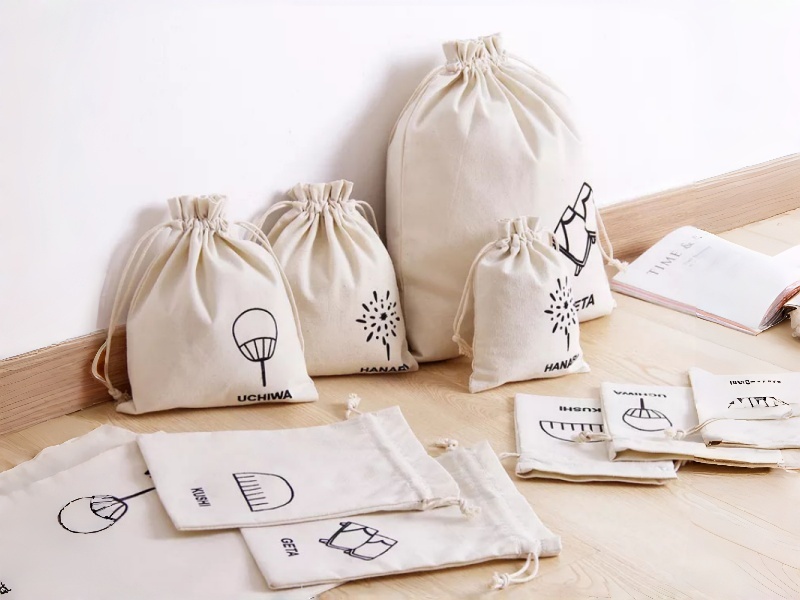
Create drawstring bags with logo that do more than carry items—they carry your brand across events, promotions, retail packaging, school programs, gyms, and product launches. Choose from polyester, cotton, canvas, nylon, RPET, and non-woven materials, with options for screen printing, heat transfer, sublimation, and embroidery. Match imprint size, color accuracy, cord style, and reinforced corners to real use needs. The right logo drawstring bag improves brand visibility, daily reuse, and pack-out efficiency, while keeping your message clear and consistent across different campaigns and order volumes.
Logo Bags Outperform One-Time Giveaways
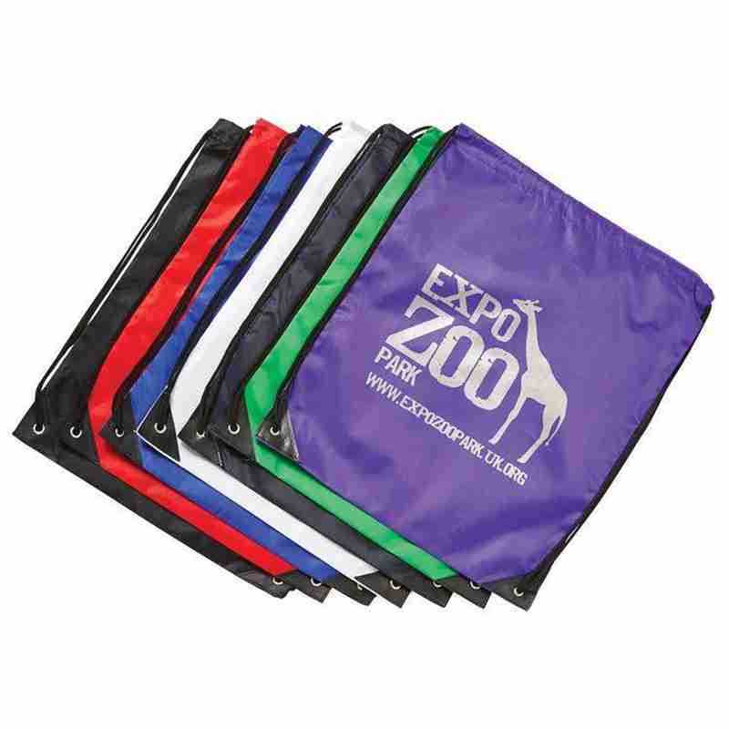
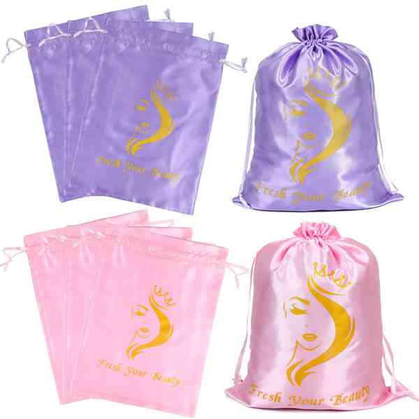
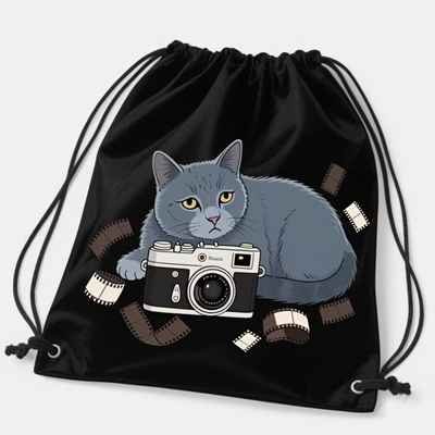
A logo drawstring bag often lasts longer than many one-time handouts because it serves two purposes: it carries the message and the items. Public product guides repeatedly place printed drawstring bags in schools, clubs, sports, trade shows, and event handouts, where the bag is expected to move beyond the giveaway table and continue into daily use. That continued visibility is what gives this format unusual value compared with items that are consumed, discarded, or forgotten quickly.
The stronger result usually comes from treating the bag as a useful branded object, not just a cheap print surface. If the bag is light, easy to carry, easy to store, and clearly visible from the front, the logo is more likely to be seen in motion. Public listings also show that even simple styles gain traction when they combine practical formats with a visible front imprint.
| What helps the bag perform longer | Why it matters |
|---|---|
| Useful daily carry | keeps the bag in circulation after the event |
| Clear front logo | improves recognition without needing close viewing |
| Light structure | makes the bag easier to keep and reuse |
| Simple storage | helps bulk distribution and later everyday use |
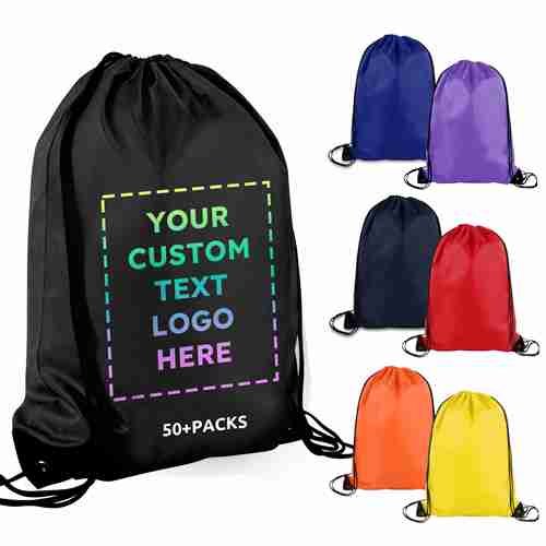
Prioritize Logo Visibility Over Flat
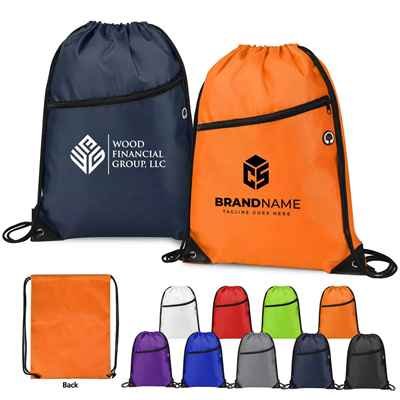
Many logo bag projects go off track because the first review happens on a flat mockup instead of in real use. A logo that looks centered on a screen may sit too low once the bag is filled. A design that feels balanced on an empty bag may become hard to read when the body curves in motion. Public drawstring bag listings repeatedly emphasize front imprint, front-and-back print, and large imprint area, which shows how strongly visibility depends on placement and viewing angle, not just artwork size.
A better first step is to decide where the logo needs to work:
| Viewing condition | What the logo should do |
|---|---|
| On the table | look balanced and clean |
| Filled and worn | stay readable on a curved body |
| Seen from a distance | rely on simple shapes and contrast |
| Seen while moving | avoid over-detailed artwork |
This is why placement matters as much as printing method. A compact logo can be stronger than a large crowded one if it stays readable. A big imprint area helps only when the layout is controlled. Public product pages with front, front-and-back, and full-color options make that pattern very clear.
Fabric Choice Affects Logo Performance
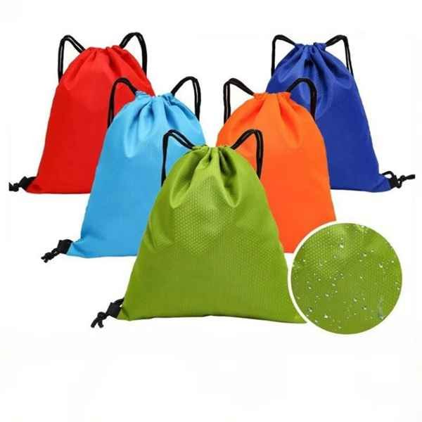
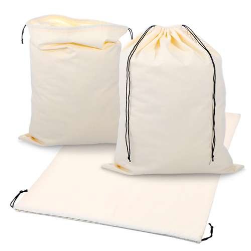
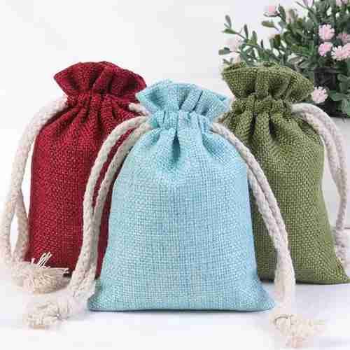
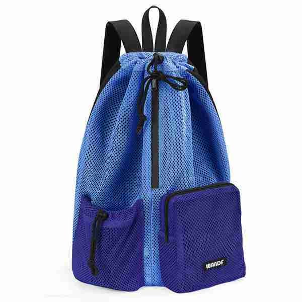
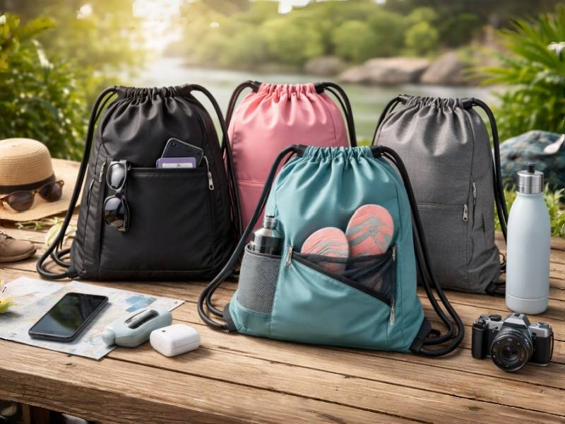
A logo does not behave the same way on every drawstring bag fabric. Public listings show 80gsm non-woven polypropylene used heavily for clubs, teams, and event distribution; 210D polyester appears repeatedly in full-color and sport-oriented styles; cotton canvas and heavier canvas show up where larger imprint areas and more tactile surfaces are needed; mesh styles are used where breathability matters more than uninterrupted print coverage. These are not minor differences—they change how ink sits, how color reads, and how sharp the logo appears.
| Fabric | Better for | What it does to the logo |
|---|---|---|
| Polyester | full color, active-use bags, brighter graphics | cleaner color response, sportier feel |
| Non-woven | budget-conscious event runs, school, and club use | simple print, lower-cost visibility |
| Cotton/canvas | natural look, screen print, embroidery | softer texture, stronger tactile identity |
| Mesh | swim, gym, ventilation needs | broken print field, more functional than graphic |
Public examples also show that imprint size and print method shift with fabric type—such as large cotton imprint areas or full-color polyester options—so fabric should be chosen together with the logo method, not afterward.
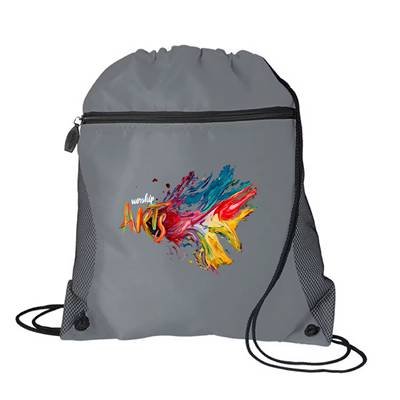
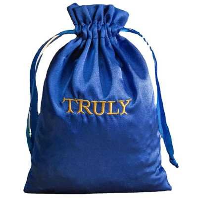
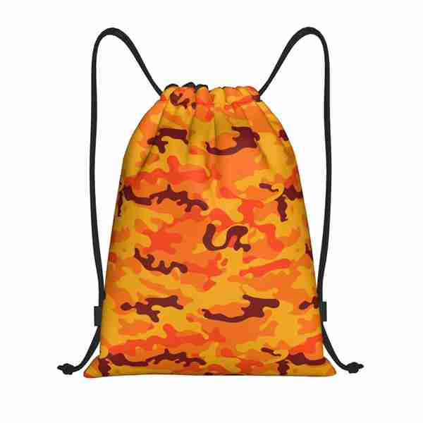
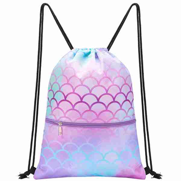
Choose the Right Logo Method
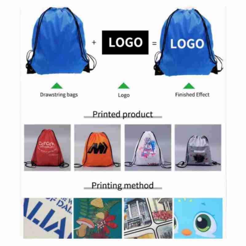
A strong logo bag rarely starts with the artwork alone. It starts with the right decoration method for the fabric, color complexity, and the use scene. Public guidance around custom drawstring bags repeatedly points to screen printing, heat transfer, sublimation, and embroidery as the main routes, with method choice tied to fabric compatibility and logo complexity. Full-color non-woven promotional bags and large-imprint cotton drawstring styles also show that the same artwork can behave very differently depending on the bag body underneath it.
| Method | Better For | What It Usually Delivers |
|---|---|---|
| Screen print | simple logos, clear shapes, cotton, canvas, non-woven | bold contrast, clean read, efficient repeatability |
| Full color or heat transfer | more detailed graphics, gradients, and small tonal changes | richer image detail, more visual variation |
| Sublimation | polyester-based bags, all-over or highly graphic layouts | smooth color flow, fuller graphic coverage |
| Embroidery | thicker fabrics, smaller marks, tactile brand detail | texture, depth, more crafted feel |
The smarter choice is not the method that sounds most advanced. It is the one that helps the logo stay clear, stable, and appropriate once the bag is actually used. A sports handout may benefit from direct, high-contrast print. A school club bag may need a simple mark that survives volume distribution. A thicker cotton bag may support embroidery well, while a lightweight polyester body may look stronger with clean print instead.
Controlled Layout Improves Imprint Value
A large imprint area sounds attractive, but space alone does not create a strong logo bag. Public product listings show notable imprint zones on cotton and organic cotton drawstring bags, including examples around 8″ × 8″ and 12″ × 12″. Those numbers are useful, but they do not mean every logo should be expanded to fill the box. A large field becomes valuable only when the layout stays intentional, balanced, and readable.
| Layout Choice | What Usually Happens |
|---|---|
| Logo too small | The bag looks underused and less memorable |
| Logo too large | The front feels crowded and less refined |
| Too many elements | readability drops, especially in motion |
| Balanced field | better visual control and stronger recognition |
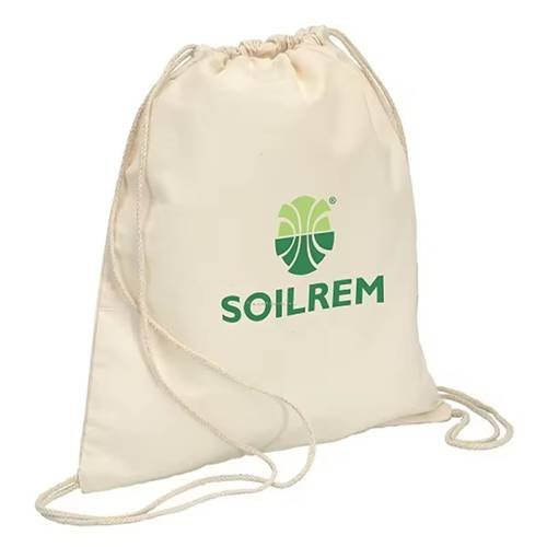
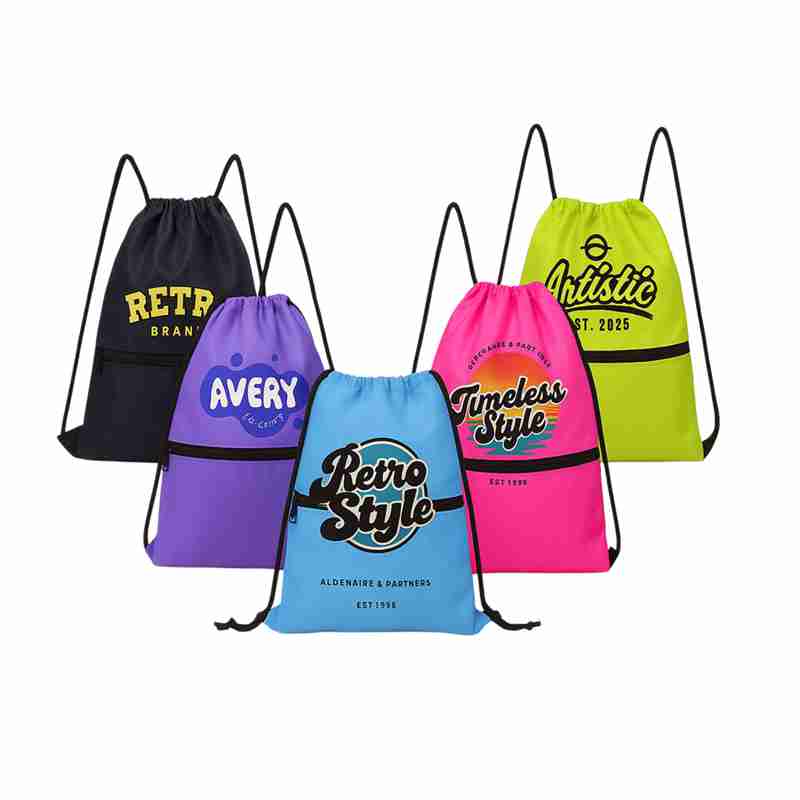
The better question is not “How much can be printed?” but “How much should be printed for this bag and this use?” A school giveaway bag may benefit from a larger, bolder mark. A club or event bag may need a centered logo with more open space. A cotton bag with a strong natural texture may look better when the front layout breathes. A full-color design may need tighter composition than a one-color mark. The best front does not simply occupy space. It uses space with discipline.




Contrast Decides Logo Readability
Distance changes everything. A logo that looks sharp on a laptop screen may disappear once the bag is worn, moving, or surrounded by other people. Public promotional bag guide consistently present drawstring bags for schools, teams, events, and giveaways, which means many of these bags are seen in motion rather than at close range. In those situations, contrast, color pairing, and logo simplicity often matter more than detail.
| Visibility Factor | Better Direction |
|---|---|
| Bag color vs logo color | use stronger contrast for faster recognition |
| Logo complexity | reduce fine lines and small text |
| Graphic density | leave room so the mark stays readable |
| Viewing distance | favor bold shapes over intricate detail |
This is why a simpler one-color logo can outperform a richer graphic in many real settings. A black bag with a dark logo may look elegant in a close-up image and weak from ten steps away. A light non-woven event bag with a high-contrast mark may feel basic up close and perform better in a crowd. A sports bag may need bold contrast; a premium cotton bag may support a quieter look if the use scene is more intimate. The stronger decision comes from matching the logo to how far away it will be seen and how quickly it needs to register.
Different Uses Need Logo Strategy
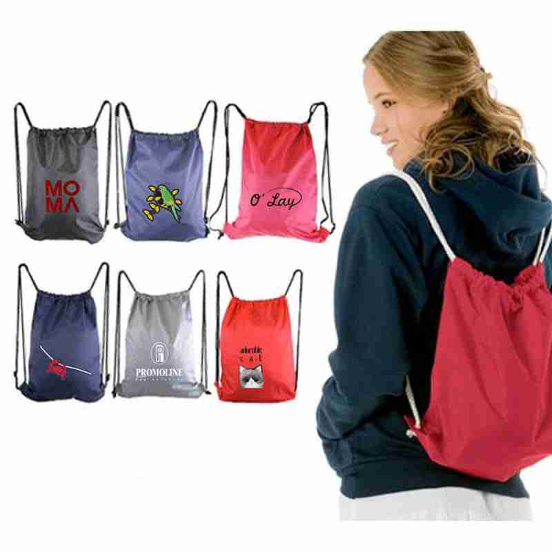
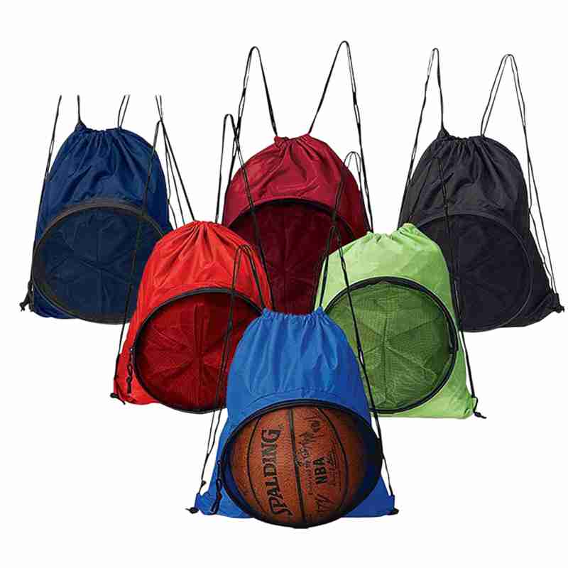
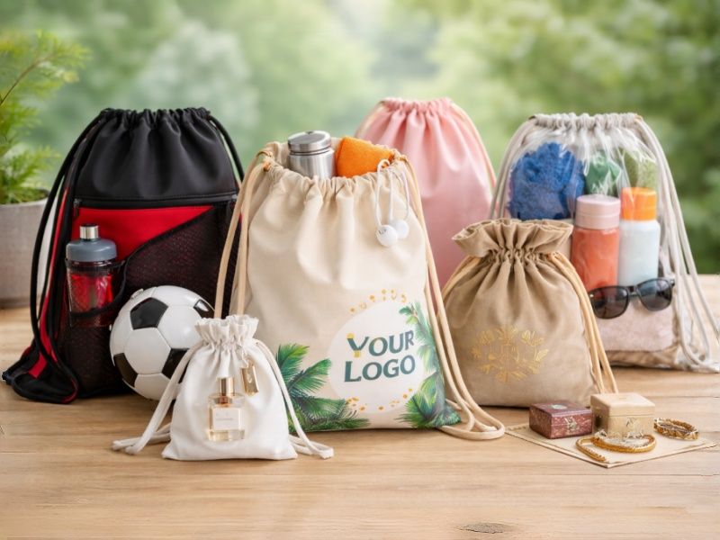
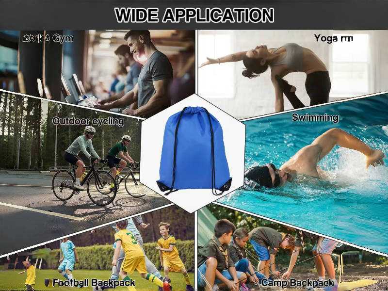
A logo that works well for a school orientation bag may be the wrong logo approach for a trade show giveaway or a sports team handout. Public drawstring bag references repeatedly group these bags into schools, sports, clubs, events, and promotions, which is useful because each use scene changes how the logo is seen, how long the bag stays in use, and how much visual energy the bag should carry. A school bag may need a bolder, simpler mark that reads quickly in groups. A sports handout may benefit from stronger contrast and a motion-friendly layout. A trade show giveaway may need a front that still looks clean when the bag is stuffed with printed materials.
| Use scene | Better logo direction |
|---|---|
| School programs | simple mark, clear contrast, easy recognition |
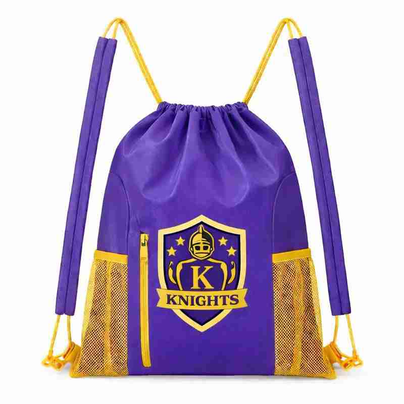
| Sports teams | bold front, stronger energy, fewer fine details |
| Trade shows | clean center layout, readable when filled |
| Club or campaign use | balanced front, good repeat visibility |
| Retail promotion | more controlled look, cleaner finish |
The same bag can carry the same logo in different ways depending on whether it is meant to be seen from far away, photographed in a campaign, distributed in bulk, or reused for weeks after the event. The better decision is the one that matches the logo to where the bag lives after it is handed out.


Common First Logo Sample Issues
The first logo sample often fails for very ordinary reasons. Not because the bag cannot be made, but because the logo was approved in the wrong conditions. Public branding guidance for bags repeatedly connects logo results to material compatibility, printing method, artwork complexity, and intended use. That means a logo can look fine in a digital file and still perform poorly once it lands on textured cotton, lightweight non-woven, or a curved filled body.
The most common problems usually look like this:
| Common first-sample issue | What it really means |
|---|---|
| The logo too low or too high | The front balance was judged flat, not filled |
| fine details disappear | The artwork complexity was too high for the method |
| The color looks weaker than expected | The fabric color or texture changed the result |
| The logo feels too big | The imprint area was used without layout discipline |
| The sample looks good only up close | distance readability was never checked |
A safer first sample review should check four states: flat on the table, filled with real contents, worn on body, and viewed from a few steps away. This catches most avoidable mistakes early. The goal of the first sample is not just to confirm that the print exists. It is to confirm that the logo still works when the bag is used the way it is actually meant to be used.
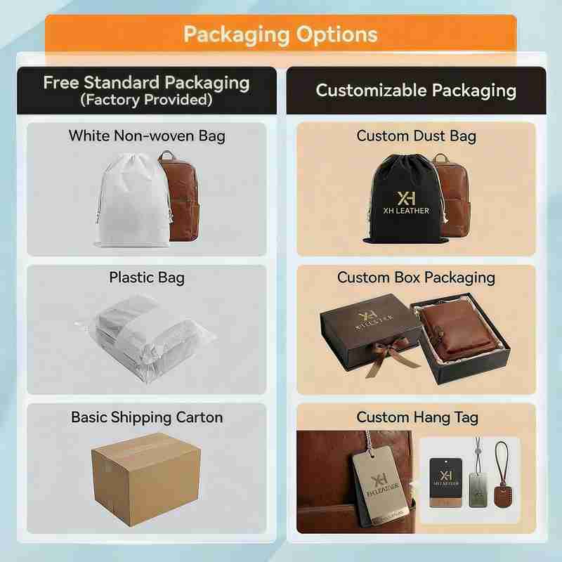
Better Logo Bags Need Better Packing
A logo bag project can look complete at the sample stage and still become messy at delivery if the packing logic is weak. Public references for customized drawstring bags show that styles can vary by color, size, pocket setup, closure details, and imprint area, while some bulk offerings also bundle multiple colors in case quantities. That matters because once a project includes multiple bag colors, grouped distributions, separate logo versions, or event-specific sorting, the success of the bag no longer depends on print alone. It depends on whether the bags arrive in a way that is easy to count, sort, and hand out.
| Packing decision | What it helps prevent |
|---|---|
| color split packing | wrong bag handed to wrong group |
| logo-version grouping | confusion across campaigns or departments |
| clear carton labels | time lost opening and rechecking cartons |
| set-packed contents | last-minute stuffing before distribution |
| master carton planning | wasted handling space and uneven packing flow |
This is especially important for school programs, clubs, trade shows, and event campaigns where bags are often handed out in groups, at speed, or alongside printed materials. A clean logo loses part of its value if the bags arrive unsorted, mislabeled, or packed in a way that slows distribution. Public bulk and customization references make it clear that bag variety is easy to offer; the harder part is turning that variety into a clean delivery system. The stronger projects are usually the ones that define how the bags will be packed before the first bulk run begins.


Make A Sample First?
See your idea come to life before mass production.
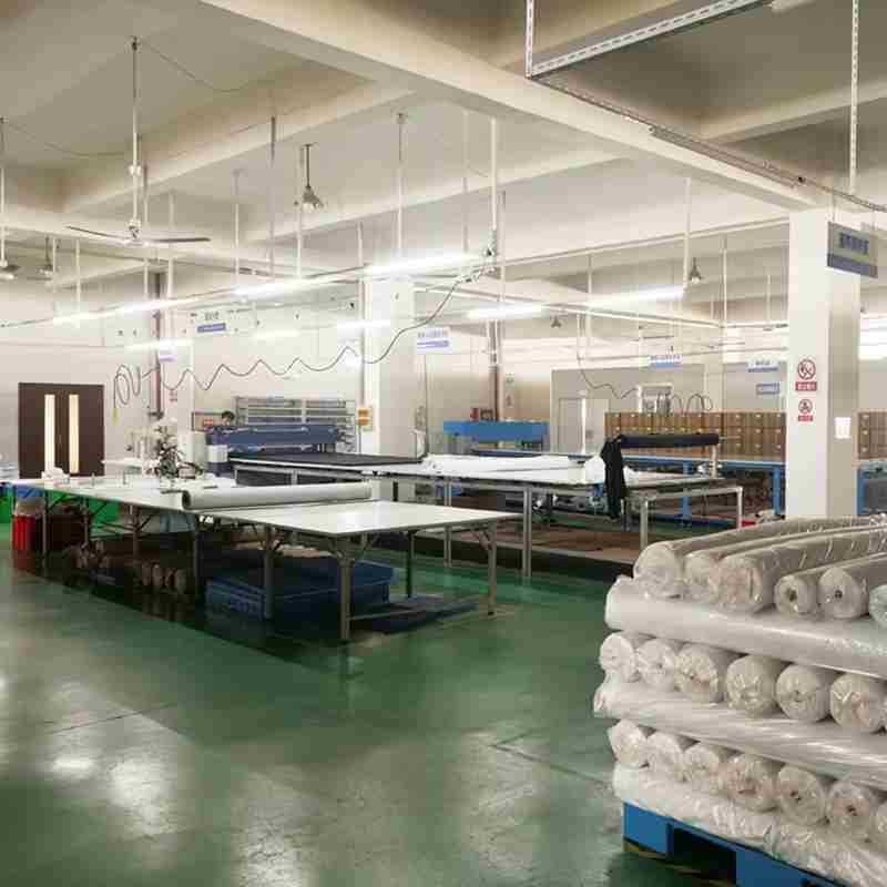
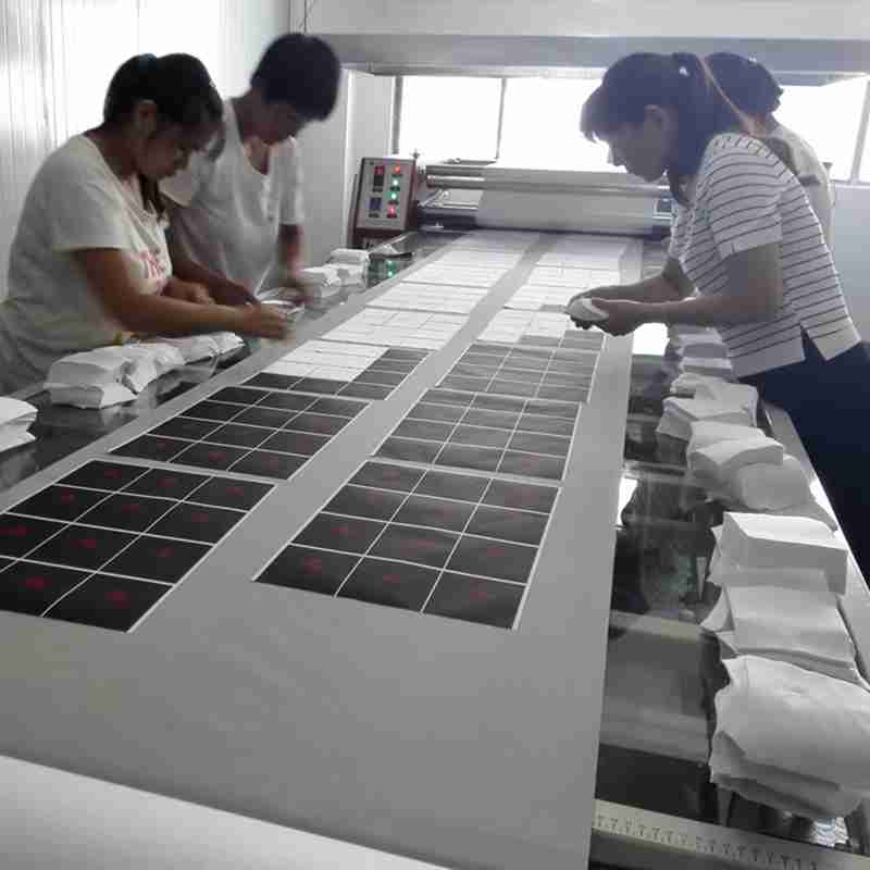
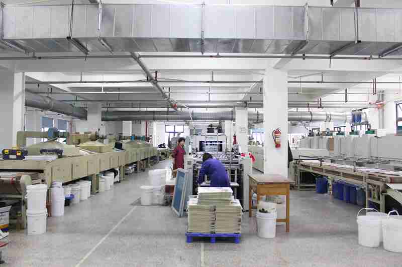
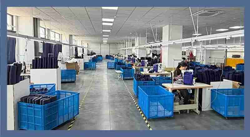
At Jundong Factory, we offer free design mockups and custom samples to ensure every detail is perfect — from material and color to logo placement and stitching.
Start your project with confidence today: info@jundongfactory.com.
FAQs About Custom Drawstring Bags With Logo
What print method usually works best for drawstring bags with logo?
The best print method is the one that matches the fabric, logo complexity, and real use scene, not the one that sounds the most advanced. Public customization guides repeatedly group drawstring bag branding into screen print, heat transfer, sublimation, and embroidery, and they also make clear that the right method depends on fabric compatibility and logo complexity. Screen printing is repeatedly positioned as a strong choice for simple logos and bulk runs, while sublimation is tied to polyester and more graphic, photo-like coverage. Heat transfer is described as useful for intricate or full-color artwork, and embroidery appears more naturally on thicker fabrics where tactile detail matters.
A practical way to decide is to start from the logo itself. If the mark is bold, simple, and easy to read, screen print is often the safest direction because it stays clear, repeats consistently, and works well in volume. If the design has gradients, tonal shifts, or richer image detail, heat transfer or full-color methods become more relevant. If the bag is polyester and the front is meant to carry a more complete graphic field, sublimation makes more sense because the color can flow more smoothly across the surface. If the branding should feel more tactile and crafted, embroidery can work well, but usually not on the thinnest, cheapest bodies.
| Method | Usually best for |
|---|---|
| Screen print | simple logos, bulk runs, cotton, canvas, non-woven |
| Heat transfer / full color | detailed art, gradients, smaller colorful graphics |
| Sublimation | polyester bags, vivid graphic coverage |
| Embroidery | thicker fabrics, smaller tactile logo areas |
The safest first decision is not “Which print method is most premium?” It is “Which method will keep this logo clear, stable, and appropriate when the bag is actually filled, worn, and distributed?” In real use, a simple high-contrast print often outperforms a more complicated method that looks better only at close range.
How large should the logo be on a drawstring bag?
A logo should be large enough to register quickly, but controlled enough to keep the front panel balanced. Public drawstring bag pages repeatedly surface measurable imprint zones such as 9″ × 9″ on non-woven bags, 10″ × 10″ on lighter cotton bags, 10″ × 12″ on larger canvas bags, and 12″ × 12″ on some organic cotton drawstring styles. Those published imprint areas are useful references, but they do not mean the logo itself should always expand to the full boundary. An imprint area is available space, not mandatory coverage.
A better sizing method starts with viewing distance and logo complexity. A very simple mark—such as a bold symbol or short wordmark—can often scale up well. A more detailed logo with fine lines, thin text, sub-brand information, or supporting graphics usually needs more restraint. The biggest mistake is not making the logo too small or too large in isolation; it is ignoring what happens when the bag is filled, curved, worn, or seen from several steps away. A logo that looks perfect centered on a flat mockup can feel oversized when the bag is worn, or underpowered when it is seen in a crowd.
| Logo scale choice | What usually happens |
|---|---|
| Too small | weak memory, underused front panel |
| Too large | crowded look, less refined front |
| Too detailed for size | loses readability fast |
| Balanced scale | better recognition, cleaner front |
The right logo size usually comes from checking the sample in four states: flat, filled, worn, and viewed at distance. If the logo stays readable and the bag still looks visually controlled in all four, the size is usually much closer to right than any digital mockup alone can prove.
Which fabric usually makes a logo look the cleanest on a drawstring bag?
The cleanest logo result usually comes from choosing a fabric that supports the artwork instead of competing with it. Public product guides show clear functional differences among 80 GSM non-woven polypropylene, 210D polyester, cotton sheeting, cotton canvas, and mesh. Non-woven is repeatedly positioned for economical event runs and broad imprint visibility; polyester appears heavily in sport and full-color settings; cotton and canvas are tied to larger front imprint zones and more tactile branding; mesh is used where ventilation matters, which naturally interrupts the print field.
That means there is no single “best” fabric for all logos. A simple one-color mark often looks clean and efficient on non-woven when the goal is fast visibility at events, clubs, or school programs. A vivid graphic or smoother color transition often performs better on polyester, especially when the project leans toward active-use or brighter visual energy. A cotton or canvas bag tends to give the logo more material character: the print can feel warmer, more natural, and more tactile, but the surface texture becomes part of the visual result. Mesh, by contrast, should be chosen primarily for function, not for uninterrupted front-panel graphics.
| Fabric | Usually strongest for |
|---|---|
| Non-woven | simple logos, economical visibility |
| Polyester | brighter graphics, full-color energy |
| Cotton / canvas | screen print, embroidery, tactile brand feel |
| Mesh | ventilation-first use, lighter graphic expectations |
The best fabric for a logo is not the one that looks nicest as a blank bag. It is the one that lets the logo stay clear, stable, and appropriate to the use scene. A logo meant for crowd visibility and fast distribution often wants something different from a logo meant for a more premium cotton bag that people may keep longer.
Is full-color worth it on a drawstring bag, or is one-color print usually better?
Full-color is worth it when the artwork truly depends on image detail, gradients, or a more complete visual field; one-color often wins when fast readability and cost discipline matter more. Public customization guides tie heat transfer to intricate, multicolor artwork and sublimation to photo-like, all-over polyester graphics, while screen printing is repeatedly positioned for bold, simple branding and bulk efficiency. Those distinctions matter because not every logo benefits from more color. Sometimes more color adds visual richness; sometimes it only adds noise.
One-color usually performs best when the bag is meant to be seen quickly, at distance, or in movement. That includes school distributions, team programs, club runs, and many event giveaways. In those settings, contrast and shape often matter more than graphic nuance. Full-color becomes more compelling when the bag is carrying a campaign visual, a more expressive graphic, or a design that loses too much if reduced to a single ink. Polyester bodies often support these richer results more naturally than textured cotton or non-woven styles do.
| Logo situation | Better direction |
|---|---|
| simple bold mark | one-color print |
| photographic / gradient art | full-color or heat transfer |
| polyester graphic bag | sublimation or full-color route |
| high-volume practical run | one-color screen print |
The safer decision is to ask, “Does the design need multiple colors to remain itself?” If the answer is no, one color often gives a cleaner and more memorable front. If the answer is yes, the right full-color method can absolutely be worth it—but only when the bag fabric and use scene support it.
What should be checked on the first logo sample before bulk starts?
Before bulk starts, the first logo sample should be judged in real use conditions, not only as a flat printed proof. Public customization guidance makes it clear that print results depend on fabric compatibility, logo complexity, print method, and intended use, and public product solutions also show how differently imprint areas behave on cotton, polyester, and non-woven bags. That means a first sample is not successful simply because the logo appears in the correct position. It is successful only if the logo still performs once the bag is filled, worn, and viewed in real conditions.
A practical first-sample review should check at least these five things:
| Checkpoint | Why it matters |
|---|---|
| flat front balance | confirms the print sits correctly on the empty body |
| filled-bag balance | shows whether the logo shifts visually once the bag curves |
| distance readability | confirms the mark still reads from several steps away |
| color and contrast | shows whether the fabric weakens or distorts the logo |
| surface durability | checks whether the print or stitch holds up to handling |
This review is where most avoidable problems show up early: a logo that feels too low once the bag is packed, colors that lose strength on textured fabric, small text that disappears, or a front that looked controlled in the mockup and suddenly feels too crowded in use. A smart sample is not just an approval object. It is a stress test for the logo. If the bag is being used for schools, sports, promotions, or trade shows, it is especially worth checking the sample in motion-like conditions rather than only under studio lighting.
How should quantity be planned for logo drawstring bags?
The safest quantity plan starts from distribution logic, not from a rough target number. Public promotional bag solutions show that stock-decorated drawstring bags can start in relatively low quantities, with examples such as orders as few as 50, 72, 75, or 100 depending on style, material, and supplier setup. That is useful as a public reference, but it should not become the only rule for a custom run with specific colors, logo versions, or packing requirements.
A better planning method is to split the quantity into layers: confirmed recipients, buffer stock, color or group allocation, and future continuity. A school program may need reserve units for late participants. A club program may need separate counts by house color or department. A trade show run may need more bags than expected because staff often start using them to pack samples or printed materials during the event itself. Public pages that position drawstring bags for schools, teams, conferences, and giveaways all suggest that real distribution conditions matter as much as unit price.
| Quantity layer | What to define early |
|---|---|
| Core count | how many bags are truly needed |
| Buffer | extra bags for late additions or replacements |
| Color split | how many units per color or group |
| Future use | whether this is a one-time run or the first batch |
The strongest quantity decision is rarely the cheapest-looking one. It is the one that keeps the distribution smooth, avoids under-ordering, and does not force rushed reorders later. A logo bag project becomes much easier when the quantity is tied to who gets the bag, how the bags are grouped, and whether the program needs backup stock.
Is front-and-back printing worth it on a logo drawstring bag?
Front-and-back printing is worth it only when the second side has a real job to do. Public product guides explicitly offer front and back imprint areas on some non-woven and promotional drawstring bags, which confirms that two-sided decoration is a common option, especially for school events, conferences, and broad giveaway use. But a second side should not be added just because the bag technically allows it.
A second print side usually makes sense when the bag needs to carry two layers of information: for example, a logo on one side and event branding, sponsor names, a program title, or a secondary message on the other. It can also make sense when the bag is likely to twist in movement, so visibility from more than one angle matters. But when the front already carries a strong logo and the bag is being produced in a high-volume giveaway format, adding another print side can sometimes create more visual noise than value. The more text and graphics are split across both panels, the more discipline the layout needs.
| Two-side printing makes more sense when… | It may not be worth it when… |
|---|---|
| the back carries useful event info | the front already does the full job |
| visibility from either side matters | the second side only repeats without purpose |
| the bag is part of a campaign set | cost and speed matter more than extra content |
The stronger question is not “Can this bag be printed on both sides?” but “Does the second side improve recognition, message clarity, or distribution usefulness?” If the answer is yes, it can be worth it. If the second side only repeats what the front already communicates, a cleaner one-sided layout is often the better result.
Should the bag color follow the logo, or should the logo be adjusted to the bag color?
In most cases, the better decision is to build the final look around contrast and readability first, then adjust color matching inside that rule. Public references show non-woven and polyester drawstring bags offered in many stock colors or custom colors, and they also emphasize that logo layout can be previewed before production. That reflects a practical truth: a color match that looks brand-correct in theory can still fail if the logo loses contrast on the actual bag body.
A stronger workflow usually starts by ranking priorities. If the bag’s main job is crowd visibility at schools, events, or team distribution, the safest choice is often a bag-and-logo combination with faster contrast. If the bag is part of a more premium campaign, brand palette discipline may matter more, but even then the front still needs enough separation to stay readable. Public listings for bright polyester bags, full-color bags, and multi-color event bags make this especially visible: color variety is easy to offer, but a good combination still depends on how the logo sits against the bag tone.
| Priority | Better color decision |
|---|---|
| Fast recognition | stronger contrast first |
| Brand consistency | color match, but not at the cost of legibility |
| Premium restrained look | lower contrast can work if viewing distance is closer |
| High-volume event use | simple, high-contrast combinations usually win |
The safer rule is this: let the logo stay readable first, then refine the brand color relationship. A perfect brand shade that disappears on the bag is usually weaker than a slightly adjusted shade that remains visible in real use.
How should multiple bag colors, logo versions, or event groups be packed to avoid confusion?
The safest packing logic is decided before bulk starts, not after the bags are already printed. Public wholesale and promotional listings show drawstring bags available in multiple colors, multiple stock options, and grouped case quantities, while event-oriented solutions also make clear that these guides are often distributed in schools, conferences, clubs, or promotions where sorting happens under time pressure. That means packing is not a back-end detail; it is part of whether the logo bag performs smoothly at the point of handout.
A cleaner bag project usually defines three things early: what varies, how cartons should be labeled, and whether bags ship empty or pre-packed. If the project includes multiple bag colors, cartons should be clearly split by color and count. If the project includes different logo versions for departments, campuses, sponsors, or campaigns, that grouping should be visible on outer labels before the bags reach the destination. If the bags are meant to be stuffed with printed materials or samples, deciding whether that happens before shipment or on site changes the entire packing plan.
| Packing element | Why it matters |
|---|---|
| Color split | prevents wrong bags reaching wrong groups |
| Logo-version split | avoids campaign or department mix-ups |
| Clear carton labels | saves time during counting and distribution |
| Pre-packed or empty | affects labor at the final handout stage |
A logo bag loses value quickly if it arrives as a sorting problem. The stronger projects are usually the ones that decide whether the order is single-spec, mixed-color, mixed-logo, or set-packed before the first bulk run begins. That makes counting easier, distribution faster, and event-day confusion much lower.
How much time should be left between sample approval and final delivery?
The safest timeline starts from the in-hand date and works backward through sampling, revision, print confirmation, packing, and transit—not through production alone. Public promotional bag guides show that some stock-decorated drawstring bags can ship in as little as 2 to 5 days, depending on style and supplier setup. That is a useful public reference for simple runs, but it should not be mistaken for the true planning window of a more customized project that involves specific fabric choices, color coordination, logo revisions, front-and-back print, grouped packing, or multiple versions.
A cleaner schedule usually separates the project into stages: sample preparation, sample review, revision if needed, bulk readiness, production, and final delivery. The reason this matters is that logo-bag timing is often affected less by sewing itself and more by approval clarity. A sample that still has unresolved contrast issues, logo scale questions, or bag color uncertainty can delay the entire project more than the sewing line does. Projects with multiple bag colors, multiple logo versions, or event-group sorting also need extra time simply because the packing logic is more demanding. Public drawstring bag pages that show quick-ship products also prove the other side of the story: speed is easiest when the bag is simple and the decision-making is already finished.
| Stage | What usually takes time |
|---|---|
| Sample stage | logo scale, contrast, method, bag color choice |
| Revision stage | fixing what looked fine flat but failed in use |
| Bulk prep | locking quantities, color splits, carton labels |
| Delivery stage | transit, receipt, and final handout prep |
A practical rule is to protect the project by building buffer before the handout date, not after problems appear. A basic one-color run on a standard bag can move quickly. A fuller project with more variables should be planned like a program, not like a rush print.
Everything You Need to Know Before Customizing Your Bags
A logo drawstring bag is easy to underestimate because the product looks simple, but the real decisions sit underneath the surface: fabric, imprint method, viewing distance, contrast, imprint area, and packing logic. Customization guides repeatedly connect these bags with schools, sports teams, clubs, trade shows, giveaways, and campaign distribution, while also separating options by polyester, cotton canvas, non-woven polypropylene, mesh, and by screen print, heat transfer, sublimation, and embroidery. That pattern matters because a logo bag is not judged only when it is laid flat on a table. It is judged when it is filled, worn, seen from a distance, packed in bulk, and handed out fast.
The questions focus on the decisions that most often change the final result: which print method fits the bag, how large the logo should be, which fabric makes the logo look cleaner, whether full color is worth it, and what must be checked before bulk starts. These are the questions that usually decide whether the bag feels like a quick giveaway or a more deliberate branded item that people continue using after the event.